
Cybersecurity Research Center - Ben-Gurion University, developed as part of an academic-research initiative focused on securing modern space systems and CubeSat infrastructures.
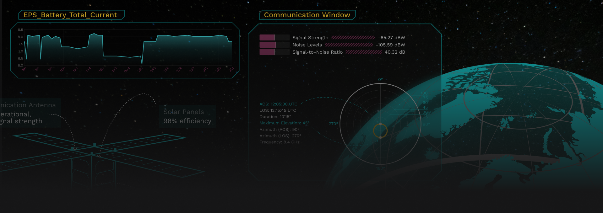
The primary challenge was to create a UI that condenses complex, multidimensional satellite data into a layout that feels intuitive and readable, especially in scenarios involving rapid real-time updates or simulated attacks.
Satellite telemetry includes dozens of parameters with different scales, units, and update frequencies. Attack simulations add another layer of complexity: the interface needs to shift instantly from “normal” to “compromised” in a way that is obvious, educational, and scientifically accurate, without overwhelming the user.
To address this, the interface was structured into four visual anchors: