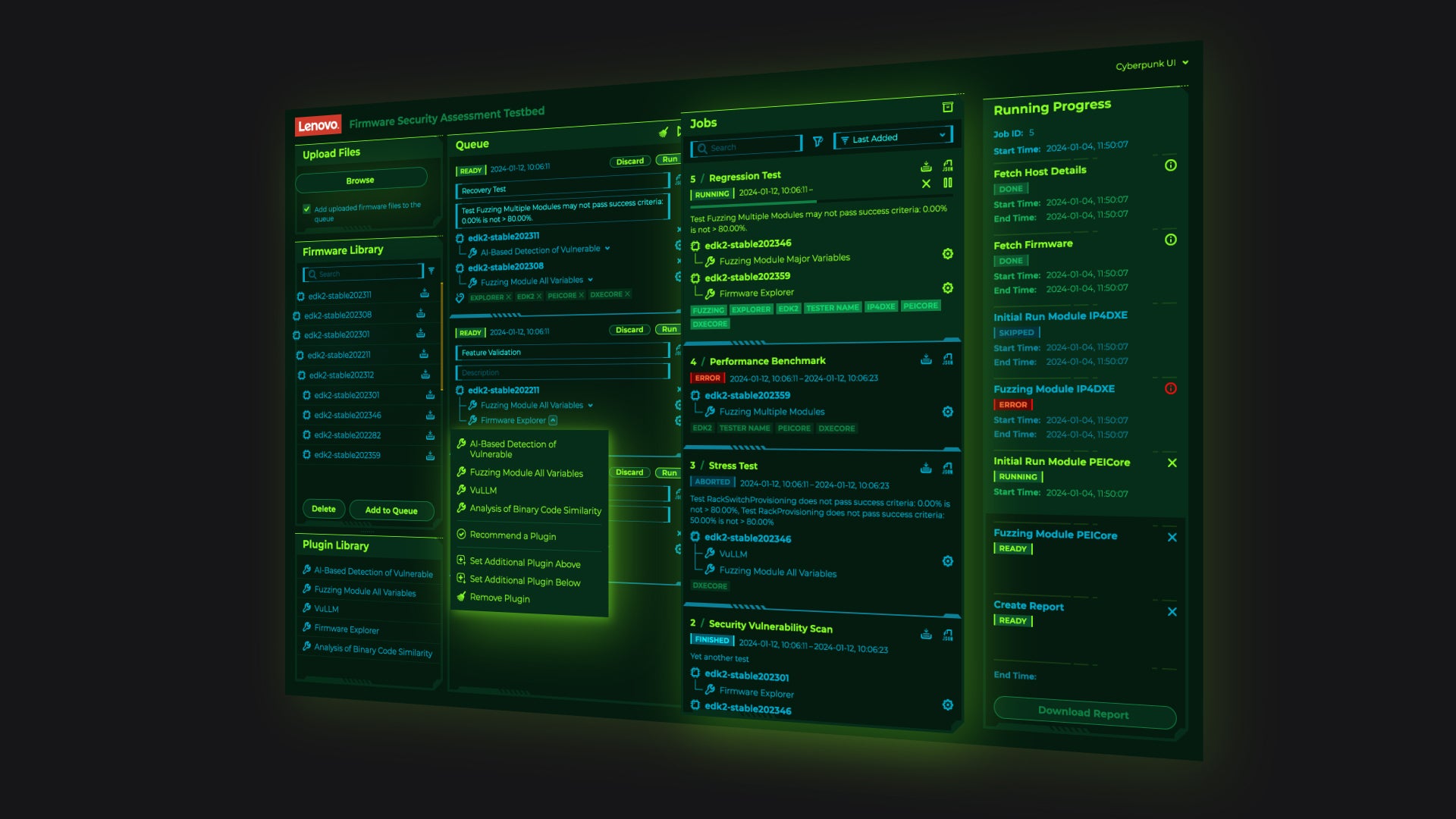
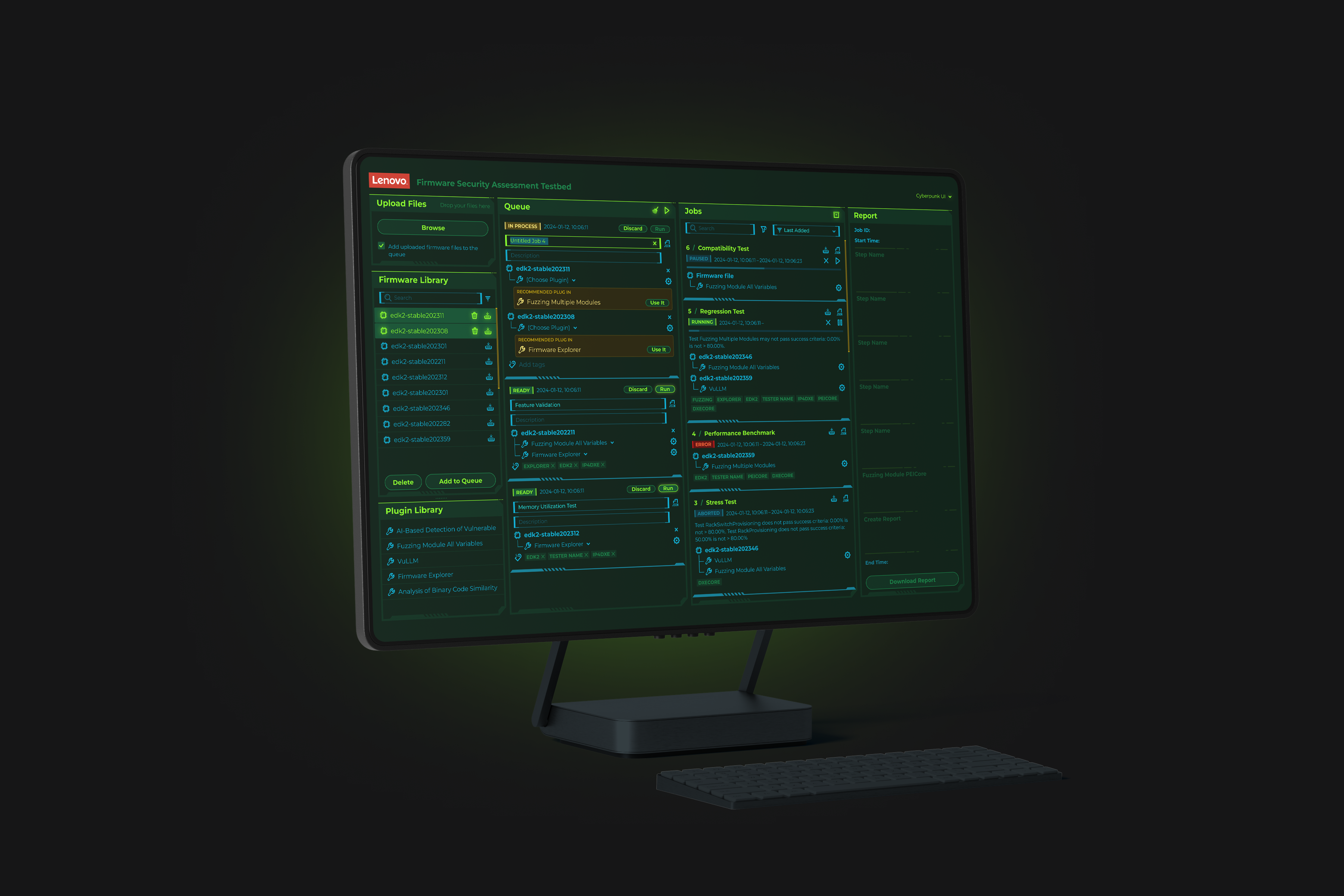
When developing the visual concept, we took into account the client’s request to align with the visual language of Lenovo’s gaming-oriented services, as well as the fact that the product is noticeably targeted at the Japanese audience.
The columnar structure was also designed with future scalability in mind, it would allow (if the client ever decides to invest in it) the creation of a mobile / tablet version without breaking the core logic. The mobile version was not requested or developed, but the concept was built to be extendable in that direction.
We chose to move toward a cyberpunk-inspired aesthetic. This is never an easy decision because decorative elements must never compromise functionality. Usability always remains the top priority.
So why add visual decoration at all? Because every product is made for people. It should deliver not only rational value, but also emotional one, users should genuinely enjoy interacting with it.
This flexibility (just like the potential mobile version mentioned earlier) had already been architected into the design system and the Figma file structure from the very beginning, which made implementation straightforward and fast.
Testing also revealed that the presentation of results should be restructured slightly. The four-column layout was retained, but the column showing progress, test results, and reports for already processed jobs was moved to become the last (rightmost) one.